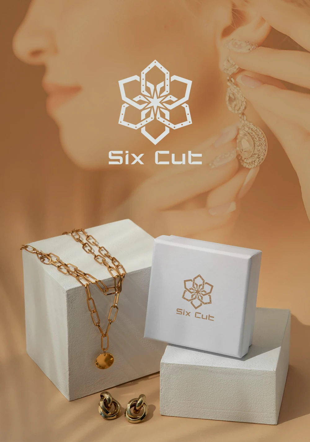
The Future of Identity: Navigating 2026 Trends in SG Logo Design
In the heart of Southeast Asia’s most competitive business hub, the stakes for visual identity have never been higher. For many local enterprises, the quest for a perfect sg logo design is no longer just about aesthetics; it is about survival in a digital landscape where attention is the most valuable currency. You’ve likely felt the frustration: you invest in a visual identity, only to realize it looks indistinguishable from twenty other startups in the same CBD high-rise. Or perhaps your current brand feels “static”—it looks great on a business card but loses its soul when shrunk down to a mobile app icon or expanded across a digital billboard in Orchard Road.
The reality of 2026 is harsh. Traditional, flat, and uninspired logos are failing. They are being drowned out by a sea of generic “modernism” that lacks emotional resonance. For a Singaporean business to thrive today, it needs a visual anchor that combines strategic depth with technical adaptability. This isn’t just about drawing a pretty symbol; it’s about engineering a brand asset that communicates authority, trust, and innovation in a split second.
2026 Branding Dilemmas in Singapore: Why Traditional SG Logo Design No Longer Captures Consumer Attention?
The Singaporean market is experiencing a profound shift in consumer psychology. As we move into 2026, the “clean and clinical” look that dominated the last decade has reached a saturation point. Consumers are suffering from visual fatigue, leading to a phenomenon where even well-designed logos are filtered out as background noise. To break through this, professional logo design Singapore experts are moving toward “depth minimalism.”
Visual Fatigue and the Rise of “Depth Minimalism”: Solving the Cookie-Cutter Market Trap
For years, the industry mantra was “less is more.” While simplicity remains crucial for scalability, it has often led to a lack of memorability. In 2026, we see the rise of depth minimalism as a direct response to this sterility. This approach maintains the clean lines of traditional minimalism but introduces subtle gradients, soft shadows, and sophisticated layering to create a sense of three-dimensionality.
When considering sg logo design ideas, think about how a flat icon can be transformed into a tactile asset. For a Singaporean fintech firm, this might mean moving away from a flat “shield” icon to one that uses translucent layers to imply transparency and security. By adding these subtle “depth” cues, a logo becomes more than a shape; it becomes an object that feels real and trustworthy in a digital-first world. This transition helps brands escape the “template trap” where every company looks like a carbon copy of a Silicon Valley tech giant.
Moving Beyond Icon Dependency: How Typography-Driven Marks Rebuild Brand Authority
A common mistake in local branding is the over-reliance on literal icons—a lion for strength, a building for real estate, or a leaf for sustainability. However, the most sophisticated logo design services singapore are now shifting focus toward custom typography and “wordmarks.”
In 2026, a brand’s personality is increasingly carried by its lettering. Custom-designed typefaces allow a brand to speak in a unique voice without the need for a separate pictorial mark. Consider how global leaders like Dropbox or eBay use flexible, character-rich typography to convey their identity. In Singapore, where multilingual communication is key, a typography-driven logo can be engineered to maintain its character across different scripts, ensuring that the brand’s “vibe” remains consistent whether it is viewed in English, Mandarin, or Malay. This moves the brand away from “decoration” and toward “authority.”
Anxiety in Chasing Trends: When Design Style Fails to Align with the Rapidly Iterating Tech Market
The pace of technological change in Singapore is relentless. From the rise of Web3 to the integration of AI in everyday services, businesses feel an immense pressure to look “futuristic.” However, chasing every fleeting design trend can lead to a brand identity that feels dated within eighteen months. The challenge for logo design Singapore is to find the “sweet spot” between contemporary relevance and timeless stability.
Retro-Futurism and Pixel Sharp: Finding Brand Personality Between Nostalgia and Innovation
One of the most powerful trends emerging in 2026 is “Retro-Futurism.” This style blends the optimistic, high-contrast aesthetics of the late 20th century with modern, high-resolution execution. For a tech startup in the Jurong Innovation District, a retro-futuristic logo—featuring neon gradients, chrome textures, or “Pixel Sharp” elements—can signal both a foundation in proven logic and a vision for the future.
The “Pixel Sharp” aesthetic, specifically, uses geometric abstraction and sharp, blocky elements to evoke the early days of computing while maintaining a high-end, professional finish. It appeals to a wide demographic: it feels nostalgic for Gen X and Boomers who remember the dawn of the digital age, while appearing “edgy” and “authentic” to Gen Z. It’s a strategic way to ground a high-tech company in a sense of tangible history.
From Storybook Gothic to Geometric Abstraction: Visual Strategies to Avoid Losing Your Soul
In the race to look professional, many Singaporean brands accidentally strip away their “soul.” 2026 is seeing a counter-movement toward “Storybook Gothic” and expressive lettering. These styles incorporate hand-drawn characters, embedded illustrations, and “toasty” color palettes that feel warm and human.
If your business operates in the lifestyle, F&B, or hospitality sectors, adopting a purely geometric or abstract logo might make you feel distant. Instead, incorporating expressive, hand-touched elements can create an immediate emotional connection. According to research from AIGA, consumers are 60% more likely to remember a brand that displays a unique, “human-centric” personality through its visual identity. By balancing these expressive elements with professional graphic designer Singapore expertise, you ensure your brand is both relatable and respectable.
2026 Professional Transformation Guide: Building a Futurist Brand Identity with Adaptive Capabilities
To remain competitive, a brand must be more than a static image; it must be a “system.” The modern sg logo design must be built with adaptability at its core. It is no longer enough to have a “primary logo” and a “secondary logo.” You need a visual ecosystem that can breathe, move, and change across different environments.
Sustainability and Eco-Aesthetics: Using Earthy and Nocturnal Tones to Build High-End Trust
Singapore’s “Green Plan 2030” is not just a government initiative; it has shifted consumer expectations. Sustainability is now a luxury. In 2026, the visual language of “green” has evolved beyond simple leaf icons. We are seeing the rise of “Nocturnal Palettes”—deep forest greens, midnight blues, rich wine reds, and earthy tones like oat and clay.
These colors, often accented with restrained gold or copper, signal a “premium sustainability.” They suggest that a company is not just eco-friendly, but also established and sophisticated. When exploring logo design ideas Singapore, look toward these muted, sophisticated palettes. They provide a sense of calm and reliability in a noisy market. For instance, a sustainable investment firm might use a “Midnight and Sage” palette to convey both security and growth, moving away from the “neon green” cliches of the past.
Brand Discovery Phase: Translating Core Values into SG Logo Design Assets with Cultural Depth
The most successful branding projects don’t start with a sketch; they start with a conversation. A professional logo design services Singapore provider will lead you through a rigorous “discovery phase.” This is where you identify the “Why” of your business, your most profitable customer segments, and your 10-year vision.
In a multicultural hub like Singapore, this phase must also include a “cultural color strategy.” Colors carry different weights here—red can symbolize prosperity, but in certain contexts, it can also signal danger. Blue is the global standard for trust, but which shade of blue differentiates you from the hundreds of other banks and insurance firms? By translating your core values into a specific visual vocabulary, you create a logo that functions as a cultural asset, not just a marketing one. You can see examples of this strategic translation in a high-quality design portfolio.
From a Single Logo to Comprehensive Integration: Strategic Brand Positioning for Singapore Enterprises
The era of the “isolated logo” is over. In 2026, the logo is merely the starting point of a larger “Identity System.” This system includes custom icons, specific patterns, typography sets, and even motion guidelines. For a Singaporean enterprise looking to scale regionally or globally, this integration is the key to maintaining authority.
Dynamic Adaptability: Solving Technical Pain Points Across Platforms and Languages
Modern logos must be “responsive.” Much like a website, a logo should change its level of detail based on where it is being viewed. This is a core requirement for sg logo design in a mobile-first nation. A complex logo with fine lines will disappear on an Apple Watch screen or a small social media profile picture.
The solution is an adaptive system, similar to Google’s “G” mark. You have a full wordmark for your website header, a simplified symbol for your app icon, and a monochrome version for physical packaging. Furthermore, for businesses expanding into neighboring markets like Indonesia or China, the logo system must be designed to accommodate different character sets without losing its visual DNA. This level of technical foresight is what separates amateur design from professional brand engineering. 🛠️
| Adaptive Asset | Primary Use / Purpose |
|---|---|
| Full wordmark | Website headers and full-brand communications where detail and tagline use are required |
| Simplified symbol | App icons, favicons, and small-screen avatars where clarity at small sizes is critical |
| Monochrome version | Physical packaging, embossing, single-color print runs, and versatile brand uses |
| Character-set accommodations | Variants engineered to work across Latin, Mandarin, and regional scripts without losing visual DNA |
From Hand-Drawn Expression to Professional Polish: Consistent Impact in Digital and Physical Worlds
Finally, the most successful brands of 2026 are those that bridge the gap between the digital and physical worlds. While we live in a digital age, the “tactile” still matters. A logo that looks great on a screen must also feel premium when embossed on a business card, printed on a tote bag, or etched into a glass office door in Raffles Place.
This is where “expressive lettering” meets “professional polish.” By combining the warmth of hand-drawn elements (which suggest craft and care) with the precision of geometric construction (which suggests scale and reliability), you create a brand that feels complete. Whether a customer interacts with you via a TikTok ad or a physical pop-up shop at Jewel Changi, the visual experience should be seamless.
According to Forbes, brand consistency across all platforms can increase revenue by up to 23%. This is why the integration of logo design ideas Singapore into a full brand manual is no longer a luxury—it is a strategic necessity for any business serious about its future.
Conclusion: Dominating the 2026 Landscape
As we look toward the future of the Singaporean market, it is clear that the “standard” logo is dead. To stand out, businesses must embrace the complexity of the modern consumer. You need a design that offers “depth,” a system that offers “adaptability,” and a strategy that offers “cultural resonance.”
Whether you are a startup looking to disrupt the fintech space or a traditional family business seeking to modernize for the next generation, your visual identity is your most potent tool. It is the silent ambassador of your brand. By investing in professional sg logo design that prioritizes long-term strategy over fleeting trends, you aren’t just buying a graphic—you are building an asset that will continue to pay dividends for decades to come. 🚀
In the 2026 market, you have a choice: you can be another invisible face in the crowd, or you can be the brand that everyone recognizes, trusts, and remembers. The journey starts with a single, strategically crafted mark. Under the guidance of expert logo design services Singapore like SGDesign Pro, your brand can transition from a simple name to a powerful visual authority. Ready to redefine your identity? The future of Singaporean branding is here, and it’s time to claim your place in it.